
Text alternatives or guideline 1.1 means that you should provide a text alternative to all content that is not text on your website.
There are a few exceptions, which we’re going to discuss about later but basically, every time you put content that is not text, unless it falls into a couple of exceptions, you must provide a text alternative.
That does not mean images of text. It means electronic text and the reason that is, is because electronic text is very versatile. You can zoom it, you can have a braille refresher device and translate it into braille, have screen readers announce it, etc.
It is so versatile, accessible and also the easiest to add to your website. It’s much easier to just type text than take a photo or hire a professional photographer to take a photo.
As to how exactly to provide text alternatives, it varies from medium to medium. For example, you have a personal website and with your headshot on it with an alt attribute to your image element
However, when it comes to images, it depends greatly on the context and providing a text alternative for image does not necessarily mean that you have to describe the image.
Sometimes it does but sometimes, you have to transcribe the meaning of the image or the context of the image. For example, a personal website with headshot will use an alt attribute that says your name. It will need not to describe your features such as your age, color or other physical features because it does not matter.
People are not going hire you for my appearance but rather for my skills. But you need to transcribe your image so that the screen reader or someone who visits your website with visual impairments would figure it out that you put an image of herself on your website.
When it’s necessary to directly describe an image in the alt attribute tag is when the context of the image is important for the overall page.
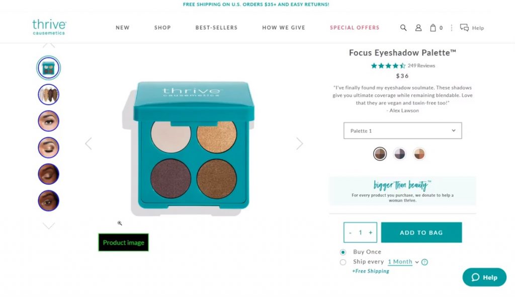
For example, you have a website that sells cosmetics. And we are browsing an eyeshadow palette. What the eyeshadow palette image represents is extremely important because the user would want to know whether they want to buy it or not and to do that, they’d have to look at the image.
Let’s say that the alt attribute for the image is “product image”. This is a good example of a text alternative done wrong because first of all, you should never add the word “image” or “picture” because the screen reader is going to announce it anyway. It’s going to say “graphic” unless it’s a diagram or a chart.
The word “image” is redundant so you shouldn’t include it your alt attributes and “product image” is absolutely useless.
The common mistakes of web designers or developers that they know that alt attributes need to be filled in but they do something randomly.
The correct way to fill in the alt attribute is that you have to describe the product in very much detail.
In this example, you can start with “a case of eyeshadows with four shadows” and then you have to describe the color of each and every individual shadows.
Now when it comes to cosmetics, with eyeshadow, sometimes brands like to include really weird names for their for their colors of the eyeshadow.
For example, instead of saying “yellow” or the real color, they’re going to name it to Cheetos, bananas or something like that.
In this case, it should be changed from “product image” to something like “an eyeshadow palette with four shadows white, gold, brown and light brown”.
And if you really need to be very specific with the color then you should consult the product manager.
This way, when a screen reader announces the alt attributes, it will announce the names of the shadows and the colors and then users will be able to understand what this image is about.
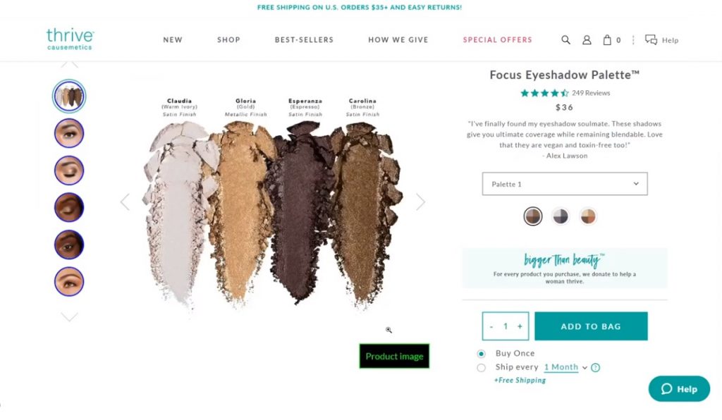
Here we have the second image of this product and see how they added these weird attributes: Claudia, Gloria, Esperanza and Carolina. Those are still not color names.
But then in parentheses, they added warm ivory, gold, espresso and bronze, and this is really good. What they did is in the product image, they added images of text, so the text is above the eyeshadows.
However, the alt attribute is still “product image” which is still the incorrect way and what they should have done is just repeat the image of text in the alt attribute because screen reader are not capable of reading images of text.
Another common mistake is with the list of blog posts that have an image preview. What a lot of blogs do and which is incredibly wrong is whenever there is an image preview, they duplicate the title in the image alt attribute and this is so wrong.
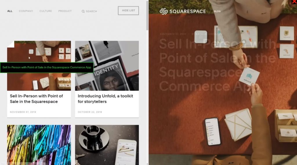
For example, the title of the blog post is “Sell In-Person with Point of Sale in Squarespace” and the alt attribute is “Sell In-Person with Point of Sale in Squarespace” as well.
This is wrong because whenever a screen reader lands on that article, it’s going to read the title of the link and then it’s going to repeat the same title for the image.
The better option here is just add a “no alt” attribute because those images are not content. They’re just for eye candy to attract attention but they don’t serve any content.
This is done so many times and this is in violation of guideline 1.1.
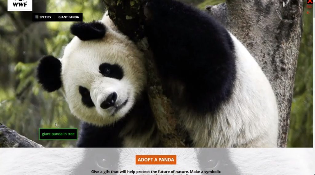
A good usage of the alt attribute is this page from the World Wide Fund. The alt attribute reads “giant panda in tree” and this is important because this image is a content because this is a page about pandas.
What they did is they described what is happening inside the image in the alt attribute. This is how it should be done.
Remember, always describe the context and the meaning of the image, not necessarily the image itself.
Audio-Only Content
When it comes to audio only content like podcasts, it is imperative that you provide the transcript of the podcast.
In this podcast example, they don’t have a transcript. They have a description, time jumps, but they don’t have a transcript. So if someone is deaf or hard of hearing, they won’t be able to consume the product.
Those things that they added are really good but they a transcript is missing which means this remains to be in violation of guideline 1.1 and guideline 1.2 time-based media.
Also keep in mind that when it comes to the guideline 1.1 which states that we should provide text alternatives, it is not only images. It is any content that you add unless it falls into a couple of exceptions that is not electronic text.
Here’s an example of providing a transcript with a podcast. They have the podcast player where you can play and listen to and right beneath it is the transcript. This is transcribed word for word with the names of the speakers that are currently speaking.
This is amazing and this is what you should do to achieve accessibility and to meet guidelines 1.1 and 1.2.
Exceptions
1. The first exception to non-text content that you don’t have to provide an alternative to is input forms or any inputs that you add to your page.
And the reason for that is because that content requires user interaction so if you just add the text alternative, it’s not going to do anybody any good.
What you have to do though is you have to provide a name or a label for each input.
And when we say name, it doesn’t mean the name attribute. We mean a label which is called a name.
2. Another exception to this rule is if you have non-text content that is a test.
For example, if you want to create an online quiz online and you added a text alternative, you’re basically providing the answers in electronic text and it’s going to defeat the purpose of the quiz.
What you need to do in this case is structure your quiz in a way that is easily understandable by screen readers.
If it has labels, headings and the next button is very clear, users with disabilities will still to be able to complete the quiz when they are using a screen reader.
3. The other exception to the rule is when the experience added to the content is purely sensory.
For example, if you are listening to a symphony or if you are watching a speed drawing. These are very popular examples
These cannot be accurately transcribed through text alone but you should at least add an identifier. As an example, the title for the symphony should be “the symphony in Paris” and the speed drawing should have a title to describe like “speed drawing of Emma Watson” and that will be sufficient.
4. The other exception is captcha. Since you cannot add the solving of the captcha in text because then robots will be able to fill it in, what you can do is add a phone number where people can call if they need assistance with the captcha.
You can also provide an alternative captcha that is easier to solve by people with disabilities but it is, at the same time, impossible to solve by robots.
5. The last exception to the rule is if you have content that is purely a decoration, then you must add a note, attribute, or even better include that content if possible via CSS.
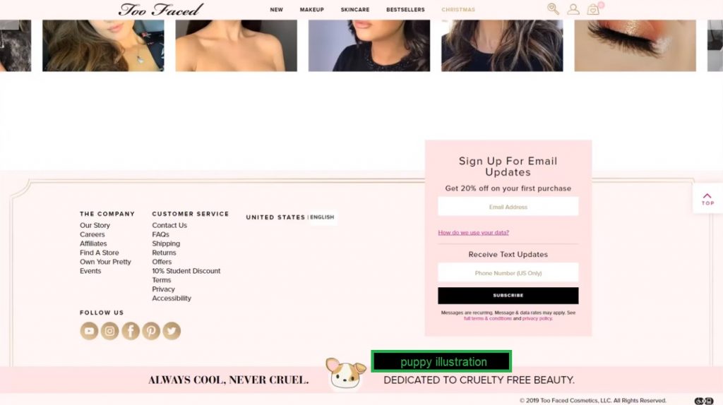
In this example, we have in the footer a disclaimer that says, “Always cool, never cruel” which means that this brand does not test on animals. Then they have a picture of a puppy, which is just a decoration.
Yes, it adds cuteness but it does not add any content. In this case, they actually added an alt attribute that says “puppy illustration” but this is completely redundant since this image is only for decoration.
Also, while we’re on the topic of including images via CSS, never include a content image via CSS background image property because you won’t be able to add an alt attribute and search engines would just skip it.
We have seen this happen a lot with product images. They’re just added as background images for some reason and this is in violation of the guidelines.
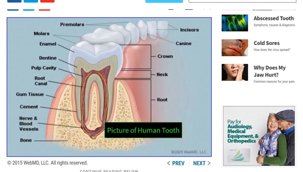
Here’s a more complicated example. This is a medical diagram showing the position of the tooth but the alt attribute for this diagram just says “Picture of Human Tooth”.
And not only that, they used the title case which is not recommended. Sentence case should be used when writing alt attributes unless it pertains to a name.
Another mistake here is that the alt attribute gives no information whatsoever to the screen reader.
What they should have done is to describe in detail what the diagram depicts and add the word “diagram” because the screen reader is going to say “graphic” but this is a graphic of a diagram.
However, the screen reader is not going to know that so what they should have done is “diagram of the lower jaw teeth” and then add more detail.


Never knew that there are rules for doing text alts. This is really informative. Thanks for sharing!
This guide is really useful for writing the right text alts. This is a concept that most of us know very little.